Illustrations and Icons
Icon Illustration
Custom icon illustrations for your brand, web, or app project will give your project a unique look. Your project will stand out with hand-crafted icons for user interfaces and brands.
Premium Icon Design that elevates your customer's experience with your brand!
What are icon illustrations, and why it makes sense to have custom icons?
The world is getting extremely digitized, sometimes a little too much that there is a loss of personalization. With a growing number of products and online tools being released daily, products and websites are looking very similar daily.
This is where icon design provides a level of uniqueness that often gets lost as the standardized designs get simplified and, to be honest, boring. Custom icon design is a way to add a level of personalization to your products and start building your ecosystem for users to interact with. Like your logo, these are minor contact points like the home button, the notification bell, or simply an X icon to dismiss a page.
Successful products across the board use this personalization tactic to define icon styles for one or more of their products. Meta (formerly Facebook) uses this in all their products for creating a new post, Google uses these to identify each of their tools in the menu next to your profile, and Apple uses SF symbols that should be used with their ios system fonts to make their User Experience uniform.
So what does that mean for you? When building a product, you want your platform and its voice to be the loudest. You don't want to get lost in the sea of less effective products and neither be associated with the giants in the industry that can bring backlash or, worse legal action. Icon illustrations aren't limited to online products. Still, a business with any level of branding can use premium icons to make the user experience uniform in an online and digital space.
That is why you need custom icon illustration that is true to your brand guidelines works with and represents your features while simultaneously delivering on existing user experience expectations.
Things to consider before you seek an Icon Designer
Icon illustration or Icon design seems pretty straightforward. A home icon, a hamburger menu, a notification bell, and some fillers for the specific app pages at the bottom of the screen. But you can't throw caution to the wind regarding icon design. With so many different styles of icons already out in the world, not paying attention to your icons is a missed opportunity and could deter you once you start getting traction on your product. Here are a few things to consider before you hire an icon designer:
Branding, Branding, Branding
This is probably the first and foremost requirement for icon design. Your icons are probably the last few pieces of consideration regarding branding requirements. Graphic design is a sophisticated discipline, and your branding, inclusive of your logo, colors, typography, visual references, and tone of voice, all significantly impact the icons that you should have.
A fundamental requirement would be a logo, colors, and typography. These are the basics; the more detailed the brand guide, the higher the level of personalization for your icons. No two icon sets are created equal; a coffee shop with a mobile order feature would have very different icons from a fashion brand with an online store. There will be overlaps in the kind of icons required, but the design will be completely different, and a detailed brand guide will act as inspiration to help arrive at the best solutions.
Use Case
In business and the world, otherwise, interactions are everything. These will vastly differ from product to product, so it is essential to consider your interactions with customers to narrow down use cases for your icons.
For physical interactions in-store, this would mean labeling the counters, takeaway points, the washrooms, and anything you think is essential for the user to spot and know, like icons for digital displays marking different menu sections. In digital environments, this would mean a button to go to the home screen, see their user profile, a search icon, and much more. This requirement can significantly differ from business to business, so before you hire a designer, you need to know what you want the designer to design icons for.
This stage can get overwhelmingly fast, so whenever it gets too complicated, take a step back and understand what your business is and what is essential to have a better customer experience.
Any Additional Requirements
Once you have narrowed down the use cases, you should consider any additional requirements for your icons; the lack of which may not be obvious but can present itself at a later stage. So it's important that once you have your basic requirements set, you go through your requirements with more detail and make sure you have everything covered.
It's hard to determine what these requirements would look like for your business, but these may include other icons like back buttons, markers over kiosks, POS systems, etc. Most experienced designers can help you flag some of these points you may need icons for, which you may have initially missed.
Access to all requirements as early as possible allows designers to design with uniformity. Consistency in the visual weight of your icons is a major consideration when designing icons. This information will help maintain that from the smallest to the largest icon sizes, both in-app and in-store.
The Design
We have covered the prerequisites to design icons and some legal considerations before you get to the design stage. Now it's time to get going on the design stage and put all the information into a functional and unique icon set. The next few steps will cover the basics of icon design and how you and your designer can create premium icons for your business.
UX Considerations
UX, or User Experience, is used regarding icon design. Usually, the considerations for UX are often overlooked in favor of tighter relations with the brand. You must understand that insufficient or unclear icon illustrations can lead to user fatigue and confusion, harming your business by losing customers.
You need to understand what the user already knows about businesses like yours and innovate in a way that the icon design compliments what they know rather than going against the norm. A home icon should be a home icon unless you find a genius way to re-engineer it non-evasive and stick to the primary home shape. You can use different visual weights, alternating fill colors, or rounded corners, but the general shape shouldn't change.
Users are trained by the world they live in, and psychologically humans associate certain shapes and logos with something, and it's prudent for you to work with what the user knows in all cases.
Sizing and Visual Weight
Sizing and visual weight are primary considerations within your design. While icons are all different and created with different purposes, it's important to work with a standardized pixel grid for all your icons and see how they look at different sizes. What works within the app might be too simplistic for a store and vice versa. If you have made these considerations earlier, the designer knows this use case and can design accordingly.
Visual weight is the weight not in mathematical forms but rather how it appears to you visually. The mathematical weight (line size) might be more significant for a more simple icon than a detailed icon (like a form button). To function within the same icon set, its important these balances and imbalances are considered and applied accordingly in a visually consistent manner.
There may be Outliers
Skilled designers are far too aware of this when creating an icon set. In an ideal case, which designers push for, all icons would look just perfect and be easily recognizable in the blink of an eye.
However, there maybe cases where an icon isn't enough, and you need to use text to inform the user of the expected outcome. When using text with icons, ensure that you are using an icon font that is a part of your brand guideline and used uniformly through and through. What this means is that you either use text in all or a particular set of icons only. There must be logic as to when, where, and how the text will be used so that there isn't any confusion later on.
The Designer
Designers can come from multiple backgrounds and often with a varied set of skills. The service you are looking for is graphic design, but a generalist might not be the ideal choice. A graphic designer with a background in building icons and icon sets for different brands is ideal. This designer should be able to able to sketch out icons in the concept stage, visualize and add them to a pixel grid and consequently design in Adobe Illustrator or Adobe XD.
Your icon designer has 3 tasks:
-
Create easily recognizable icon sets with visual symmetry that work in all use cases at large and small sizes.
-
Design in a way that the icons are true to your branding and something that your brand can own by association.
-
Bring all the elements of your icon set together so that they work individually and with each other.
Lastly, it is highly recommended to work with a skilled designer when making your icons and not to use templates or premade icon sets as they are unoriginal and free ones are often made with little to no consideration for consistency. If you use a template for your icons, find premium templates created by talented designers who have taken some consideration about your specific niche in their icon design.
Output Processes
The hard part is through, and now it's time to output these bespoke design elements into your app, the store, and every other business collateral you can imagine.
The output processes can look very different for all use cases. So as a general direction, know that the requirements for files and formats will change over different output processes. For example, the print would be different from the web, the large scale would come with its considerations, and so forth. Confer with a designer to modify your elements for each use case before you take any significant steps in either direction.
Creatibly combined with Illustrator, Scott Luscombe can cater to any and all of your graphic design requirements for your icons and set up proper file types and collateral for your particular application. Be it working with a developer to supply UI mockups or sending out a large-scale billboard.
What is my process for
Creatibly combined with illustrator Scott Luscombe, crafts your icons individually or as a set to add a visual foundation for interactive and visually highlight content areas.
All icon illustrations are entirely original and designed just for your brand, giving you a unique look and feel that allows your brand to stand out and add visual interest to your audience.
The process begins with a short consultation call going over your requirements. After you share your branding guidelines, I will begin sketching out the designs, post which I present the concepts, and you can request a revision. I would then create the final digital illustrations, at which stage you can request one more revision. After this, I would share all the required files for application across all the standard use cases for an icon.
Your icon illustration comes complete:
• Initial Sketch for Approval and One Revision
• Final Illustration and One Revision
• Digital SVG, JPG, and Transparent PNG for Web and Print-ready AI/EPS Files
FAQs
Is an icon an illustration?
An icon always represents something in a visual form. Be it an application, a location, or a function in an interface. It's visual in nature and consolidates an idea, intended action, or expected output. So yes, an icon is an illustration because it's a visual representation of more complex thought. An example would be the home icon which illustrates an actual home but in different cases, it can mean different things. It's a point where you begin your journey, the welcome screen of the app or the indicator that shows the address to your physical home.
What is the difference between icons and illustrations?
An icon or illustration is very different in generic terms. An icon is generally simplified and makes a complex idea or interaction generally, at a small size and more simple. An illustration is more complex and shows an almost direct vision of what it represents. While they are both illustrations by definition, their general meanings are different.
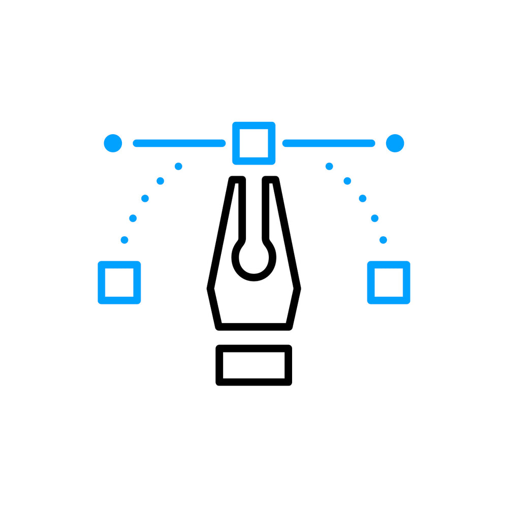
What is an icon vector?
A vector is a file type created in different file formats which can be infinitely scaled without pixelation. An icon vector is a file type created for an icon that's scalable across different sizes, from small applications to large scales. Icons are created in vector format and hence the term icon vector but they can be used as other file types as well.