Alright, buckle up and get ready for a high-octane 10-step process on how to design a kick-ass website:
Nail Your Website's Purpose: Clearly define what your website is all about. Is it a platform for your business, a showcase for your portfolio, or a hub for your blog? Knowing your website's purpose is like revving your engine before hitting the road.
Identify Your Target Demographic: Get inside the heads of your ideal audience. Figure out their desires, preferences, and online behaviors. This knowledge will steer your design decisions and ensure your website hits the right gear.
Plan that Structure: Map out your website's structure like a seasoned navigator. Create a sitemap that outlines all the internal links between key pages and how they interconnect. Think of it as your roadmap to success.
Wireframe and Prototype: Get down and dirty with wireframes and prototypes. These blueprints of your website will help you test the waters, refine your user experience, and make sure your design hits all the right curves.
Style that Design: Unleash your creative horsepower and choose a design style that screams your brand. Play with colors, typography, and visuals to create a visually stunning experience that'll leave your visitors in awe.
Make it Responsive: Don't leave anyone in the dust! Make your website responsive, so it looks and performs flawlessly on any device. From desktops to smartphones, your website's design alone should adapt like a chameleon on wheels.
Fuel it with Engaging Content: Pump up your website with high-octane content that grabs attention and keeps visitors coming back for more. Optimize it with SEO wizardry to make sure your website ranks like a champion.
Add Functional Bling: Inject some serious functionality into your design. From slick contact forms to social media integration, give your visitors all the bells and whistles they need to navigate your website like a pro.
Test, Test, Test: Time to hit the testing track. Put your website through its paces, iron out any kinks, and optimize it for maximum performance. Make it load lightning-fast, ensure it's cross-browser compatible, and unleash it on the world with confidence.
Unleash the Beast: It's time to rev that engine and launch your website. But don't stop there! Maintain it like a pro by regularly updating content, monitoring performance, and staying ahead of the game with fresh features.
Get ready to leave your competition in the dust with this turbocharged website design process. Follow these steps, listen to your users' feedback, and watch your website become a roaring success. Let's hit the road and design a website that'll make jaws drop!
Step 1: Finding Your Website's Purpose
The starting line of website design, where defining your website's purpose is the crucial first step.
Just like a driver needs to know their destination before hitting the road, understanding your website's purpose sets the direction for your design journey.
So, let's strap in and explore the ins and outs of finding your website's purpose:
Set Clear Goals:
Start by asking yourself, "What do I want to achieve with my portfolio website?" Is it to sell products or services, share information, build a community, sell online anything, or showcase your portfolio? By setting clear goals, you'll have a solid foundation for shaping your website's purpose.
Know Your Target Audience:
To create a website that truly resonates with your audience, you need to understand them inside and out. Research their demographics, preferences, and online behavior. This knowledge will help you tailor your website's purpose to meet their needs effectively.
Differentiate Yourself:
In a crowded online world, standing out is key. Identify what sets you apart from the competition and highlight it in your website's purpose. Whether it's your unique value proposition, innovative solutions, or exceptional customer service, make sure your purpose reflects your distinctive qualities.
Align with Your Brand:
Your website and online stores should be an extension of your brand's identity. Ensure that your purpose aligns with your brand values, messaging, and visual identity. Consistency across all touchpoints will create a cohesive and memorable brand experience for your visitors.
Consider User Intent:
Put yourself in your users' shoes and think about their intent when visiting your website. Are they seeking information, looking to make a purchase, or trying to solve a problem? Your website's purpose should cater to their specific needs and provide a seamless user experience.
Solve Problems:
A powerful way to define your website's purpose is to focus on solving your target audience's problems. Identify the pain points they face and position your website as a solution provider. Whether it's through informative content, intuitive navigation, or useful tools, aim to be the go-to resource for your audience.
Reflect Your Business Goals:
Your website should support your broader business goals. Whether it's increasing sales, generating leads, or building brand awareness, align your website's purpose with these objectives. This ensures that your website becomes a valuable asset in achieving business success.
Adapt to Market Trends:
Keep a finger on the pulse of industry trends and evolving customer demands. Your own website builder's purpose should be flexible enough to adapt to changing market dynamics. This agility will help you stay relevant and maintain a competitive edge.
Measure and Refine:
Once your website is up and running, continuously measure its performance against your defined goals. Analyze user behavior, track conversions, and gather feedback to fine-tune your website's purpose. This iterative approach will ensure your website remains effective and impactful.
Evolve with Your Business:
As your business evolves, so should your website's purpose. Regularly reassess your goals, audience needs, and market dynamics to ensure your website stays aligned with your business trajectory. Embrace innovation and embrace opportunities for growth and improvement.
Remember, finding your website's purpose is not a one-time task but an ongoing process. It requires continuous evaluation, adaptation, and optimization. By defining a clear purpose, aligned with your goals and audience, you'll lay a strong foundation for a website that engages, inspires, and drives results.
So, start your engines and embark on this exhilarating journey of discovering your website's purpose. The destination may be ever-changing, but with a well-defined purpose, you'll navigate the twists and turns with confidence and create a website that leaves a lasting impression. Get ready to make your online presence count and ignite success with a purpose-driven website.
Step 2: Identify Your Target Demographic
Building a successful website begins with understanding your target demographic. Identifying the specific audience you want to attract and engage with is crucial for crafting a website that resonates with them. So, let's dive into the process of finding your website's target demographic and reaching the right people.
Define Your Offering:
Start by clearly defining what your website offers. Is it a a business email address, product or service page, a service, information, or entertainment? Understanding your offering will help you narrow down your target demographic by aligning it with the needs and interests of your potential visitors.
Research Your Market:
Conduct thorough market research to gain insights into your industry, competitors, and customer preferences. Identify trends, customer behavior patterns, and demographic data that can inform your understanding of your target demographic.
Analyze Your Existing Audience:
If you already have a website or online presence, analyze your existing audience. Use website analytics tools to gather data on each site visitor' demographics, interests, and behavior. This data can provide valuable insights into the demographics you're currently attracting and help you refine your target audience.
Create Buyer Personas:
Develop detailed buyer personas that represent your ideal customers. Consider their demographics, motivations, goals, pain points, and behaviors. These personas will serve as fictional representations of your target audience, helping you better understand and cater to their needs.
Conduct Surveys and Interviews:
Reach out to your existing customers or conduct surveys and interviews to gather direct feedback. Ask questions about their demographics, preferences, and why they chose your product or service. This qualitative data will provide deeper insights into your target demographic's motivations and preferences.
Utilize Social Media Insights:
Leverage social media platforms to gather demographic data and insights. Use the analytics tools provided by platforms like Facebook, Instagram, and Twitter to understand the demographics of your followers and engagement metrics. This information can help you identify patterns and adjust your target demographic accordingly.
Explore Online Communities and Forums:
Engage with online communities and forums relevant to your industry or niche. Observe discussions, ask questions, and interact with potential customers. This will give you firsthand insights into the demographics and interests of your target audience.
Analyze Competitors:
Study your competitors' websites and online presence. Look for clues about their target demographic, such as the language, imagery, and messaging they use. Analyzing their customer base can help you refine your own target demographic and identify untapped opportunities.
Use Keyword Research:
Conduct keyword research to understand what keywords and phrases your target demographic is searching for. Tools like Google Keyword Planner can provide valuable data on search volumes and related keywords. By aligning your website content with these keywords, you can attract your target demographic through organic search.
Continuously Monitor and Adjust:
Remember that your target demographic may evolve over time. Stay vigilant and monitor changes in customer preferences, market trends, and demographics. Regularly review and refine your target demographic to ensure your website remains relevant and engaging.
By taking the time to identify and understand your target demographic, you can design a website that caters to their needs and preferences. Tailoring your content, design, and messaging to your target audience will result in a more engaging and impactful online presence.
So, put your detective hat on, gather data, analyze insights, and refine your understanding of your target demographic. With this knowledge in hand, you'll be equipped to create a website that captures the attention, resonates with, and delights your ideal customers. Prepare to connect with your target demographic and drive success with a website that speaks their language and fulfills their desires.
Step 3: Planning Your Website's Structure
When it comes to building a successful website, having a well-organized and user-friendly structure is essential.
A thoughtfully planned website structure ensures that visitors can navigate your site easily, find all the tools and information they need, and have a positive experience. In this guide, we'll explore the key steps to planning your website's structure effectively.
Define Your Goals:
Start by defining the goals of your website. What do you want to achieve with your site? Is it to provide information, sell products, generate leads, or showcase your portfolio? Clearly understanding your goals will help you shape the structure and layout of how many pages on your website.
Identify Key Pages:
Determine the key pages your business website really needs based on your goals and the content you plan to provide. Common pages include Home, About, Services, Products, Blog, Contact, and Portfolio. Consider the specific needs of your business or industry and tailor the site easy web page structure accordingly.
Create a Hierarchical Structure:
Establish a hierarchical structure for own site that reflects the importance and relationship between different web pages together. Start with a main navigation menu that includes your key pages. Subsequently, identify subpages and group them logically under the main pages. This hierarchical approach ensures that visitors can navigate through multiple articles on your site intuitively.
Use Clear and Descriptive Labels:
When naming your pages, use clear and descriptive labels that accurately convey the content of each page. Avoid vague or ambiguous labels that may confuse visitors. For example, instead of using "Services," consider using more specific labels like "Web Design," "Graphic Design," or "Content Writing."
Consider User Experience:
Put yourself in the shoes of your visitors and think about their user experience. Make sure important information is easily accessible and avoid unnecessary steps or clicks. Aim for a clean and clutter-free design that guides users seamlessly through all elements users your site.
Implement Intuitive Navigation:
Design a navigation menu that is easy to find and use. Typically, a horizontal menu positioned at the top of the page or a sidebar menu is effective. Include clear labels, use drag and dropdown menus for subpages if necessary, and consider adding a search bar for convenience.
Utilize Breadcrumbs:
Breadcrumbs provide a helpful navigational aid direct users, especially for websites with a deep structure or multiple levels of subpages. Breadcrumbs display the user's current location within the website page hierarchy, allowing them to easily navigate back to previous pages.
Incorporate a Site Map:
A site map is a visual representation of your web hosting or website's structure, displaying all the pages and how they connect. It helps users and search engines understand the organization of your site. Include a link to your site map in the footer of your website for easy access.
Optimize for Mobile:
With the increasing use of mobile devices, it's crucial to ensure your website's structure is mobile-friendly. Responsive design ensures that your site adapts to different screen sizes, providing a seamless user experience across devices.
Test and Refine:
Once you've implemented your website's structure, test it thoroughly. Navigate through your site as a user would, ensuring that all pages are accessible and the structure flows logically. Solicit feedback from users and make adjustments as needed to improve the overall user experience.
Remember, your website's structure should be intuitive, user-friendly, and aligned with your goals. Regularly review and refine your website's structure as your business evolves and new content is added. By investing time and effort into planning your website's structure, you'll create a solid foundation for a successful online presence.
So, take a step back, analyze your goals, and sketch out a clear roadmap for your website's structure. By organizing your content effectively and providing an intuitive navigation experience, you'll create a website that engages and delights your visitors, driving them towards your desired actions.
Step 4: Wireframe and Prototype Your Website
When it comes to designing a website, prototyping and wireframing play a crucial role in the development process.
These techniques allow you to visualize and test the layout, functionality, and user experience of your website before diving into the actual design and development.
In this guide, we'll explore the importance of prototyping and wireframing for website builders and provide you with a very step by step guide-by-step approach to creating an effective prototype for your website.
Understand the Purpose:
Before you begin prototyping and wireframing, it's important to have a clear understanding of the purpose and goals of your website. Identify the key features, functionalities, and content that you want to include. Consider the needs and expectations of your target audience and how your website can fulfill them.
Start with a Concept:
Begin the prototyping process by sketching out a rough concept of your website. Use pen and paper or digital tools to create a very basic idea and layout of the following web pages, including the main sections, navigation menu, and content areas. Focus on the overall structure and flow of the site.
Wireframe the Key Pages:
Once you have a concept in mind, it's time to create wireframes for the key pages of your website. Wireframes are simplified, black and white visual representations of your website's layout. They focus on the placement of content, navigation elements, and overall web page design and structure. Use tools like Adobe XD, Sketch, or Balsamiq to create wireframes that accurately represent the intended site design.
Focus on User Experience:
When creating wireframes, prioritize user experience. Consider how users will interact with your website and design the wireframes with intuitive navigation, clear content hierarchy, and user-friendly elements. Ensure that key information and calls to action are easily accessible. Keep the design minimalistic to focus on functionality rather than visual aesthetics.
Test and Refine:
Once your wireframes are ready, it's time to test them. Share them with your team or gather feedback from potential users. Use this feedback to refine your wireframes, making adjustments to improve the user experience, usability, and clarity of the design. Iterate and repeat this process until you're satisfied with the wireframes.
Convert Wireframes to Interactive Prototypes:
After finalizing the wireframes, it's time to transform them into interactive prototypes. Interactive prototypes allow users to interact with the website in a simulated environment, providing a realistic experience without the actual development. Use tools like InVision, Figma, or Adobe XD to add interactivity, including clickable buttons, navigation, and basic functionality.
Test User Interactions:
With your interactive prototype ready, conduct user testing to gauge how users interact with your website. Observe how users navigate through the prototype, identify any usability issues or confusion, and gather feedback on the overall user experience. Use this feedback to refine the design and improve usability.
Incorporate Visual Design:
Once the prototype site's performance and functionality is validated, it's time to incorporate the visual design elements. Add colors, typography, images, and branding elements to the prototype to bring it to life. Ensure consistency with your brand identity and maintain a cohesive visual language throughout the website.
Gather Feedback:
Share the visual design prototype with stakeholders, clients, or potential users to gather feedback on the aesthetics and overall visual appeal. Consider their input and make necessary adjustments to align the design with their expectations and preferences.
Handoff to Development:
Once the prototype is finalized, it's time to hand it off to the development team. Provide them with detailed specifications, including the design files, interactive prototype, and any necessary documentation. Maintain open communication with the development team to ensure a smooth transition from design to development.
By following these steps and investing time in prototyping and wireframing, you'll be able to validate your website's functionality, optimize the user experience, and minimize the risk of costly design changes during the development phase.
Prototyping and wireframing help you iterate and refine your design, resulting in a well-thought-out and user-friendly website that meets the needs of your audience. So, take the time to prototype and wireframe your website, and watch as it evolves into a seamless and engaging online experience.
Step 5: Brand Style and Design
When it comes to designing your website, it's time to let your creative spirit run wild. This is your opportunity to create a visually stunning experience that not only captures attention but also reflects the essence of your brand. In this guide, we'll explore how you can choose a design style that screams your brand and utilize colors, bold typography, and visuals to create an awe-inspiring website that leaves your visitors in awe.
Define Your Brand:
Before diving into the design process, it's crucial to have a clear understanding of your brand identity. Define your brand values, personality, and target audience. This will serve as the foundation for your design choices. Your website should align with your brand's unique essence and resonate with your intended audience.
Choose a Design Style:
Selecting the right design style is key to creating a visually stunning website. Explore different top design trends and styles such as minimalist, modern, vintage, or bold and vibrant. Consider the emotions and impressions you want to evoke in your visitors. Whether it's sleek and sophisticated or playful and energetic, choose a style that aligns with your brand personality.
Play with Colors:
Colors have a powerful impact on our emotions and perceptions. Harness the power of color psychology to evoke specific feelings in your website visitors. Choose a color scheme or palette that reflects your brand and creates the desired mood. Consider the contrast between background and text colors for optimal readability. Don't be afraid to experiment with bold and unexpected color combinations to make your website stand out.
Typography Matters:
Typography plays a crucial role in web design. Select fonts that align with your brand personality and are legible across different devices and screen sizes. Consider pairing fonts to create a visual hierarchy and enhance readability. Experiment with font sizes, weights, and styles to highlight important elements and guide your site visitors'' attention. Remember, typography should not only be aesthetically pleasing but also contribute to a seamless user experience.
Visuals that Pop:
Visual elements are powerful tools to captivate and engage your audience. Incorporate high-quality images, illustrations, or videos that align with your brand and enhance your message. Ensure that visuals are relevant to your content and evoke the desired emotional response. Utilize whitespace strategically to create a clean and visually appealing layout. Balance your use of visuals with text to maintain a harmonious design.
Consistency is Key:
Consistency in design is crucial for creating a cohesive and professional website. Establish a consistent visual language across your website by using the same colors, typography, and visual elements throughout. Consistency builds trust and familiarity with your audience, making navigation and understanding your content easier.
Mobile-Friendly Design:
With the increasing use of mobile devices, it's essential to prioritize mobile-friendly design. Ensure that your website is responsive and adapts seamlessly to different screen sizes. Optimize images and videos for faster loading times on mobile devices. Pay attention to the placement of important elements and ensure easy navigation on smaller screens.
User-Focused Approach:
While it's important to create a visually stunning website, never forget the user experience. Design your website with your visitors in mind. Make navigation intuitive and user-friendly. Optimize load times for a smooth browsing experience. Prioritize accessibility by considering color contrast, font sizes, and alternative text for images. Test your website on different devices and browsers to ensure a consistent experience for all users.
Iterate and Refine:
Design is an iterative process. Continuously seek feedback from users, stakeholders, or design experts. Analyze user behavior through analytics tools to identify areas for improvement. Iterate and refine your design based on feedback and data to create an even better user experience.
Showcasing Your Brand:
Your website is a platform to showcase your brand and what sets you apart. Use it to tell your personal brand story, highlight your expertise, and showcase your portfolio or products. Incorporate testimonials or client reviews to build trust and credibility. Ensure that your brand's voice and messaging are consistent throughout your website.
Designing your website is an opportunity to unleash your creative horsepower and create a visually stunning experience that reflects your brand's essence. You can create a website that captivates and engages your visitors by choosing a design style that aligns with your brand, playing with colors, typography, and visuals, and prioritizing user experience. So, let your creativity shine and design a website that leaves a lasting impression.
Step 6: Make it Responsive On All Devices
In today's digital age, having a responsive and optimized website for all devices has become more crucial than ever before.
With the rapid growth of mobile usage and the diverse range of screen sizes and resolutions available, ensuring that your website provides a seamless browsing experience across desktops, laptops, tablets, and smartphones is essential.
This guide'll explore the importance of making your website responsive for all devices and how it can benefit your business.
Improved User Experience:
Responsive design ensures that your website adapts and displays properly on any device, providing an optimal user experience. Users can easily navigate, read content, and interact with your website, regardless of the device they are using. A responsive website eliminates the frustration of zooming, scrolling, or resizing, making it more likely for visitors to stay longer, explore your content, and take desired actions.
Reach a Wider Audience:
Mobile devices have surpassed desktops in terms of internet usage, making it essential to cater your web traffic to mobile web users first. By having a responsive website, you can reach and engage a larger audience across various devices. Whether users access your website on a smartphone during their commute or on a tablet while relaxing at home, a responsive design ensures that your content is accessible and visually appealing, increasing the chances of converting visitors into customers.
Search Engine Optimization (SEO) Benefits:
Responsive design plays a significant role in improving your website's search engine rankings. Search engines, like Google, prioritize mobile-friendly websites in their search results. By having a responsive design, you increase your chances of ranking higher in search engine results pages (SERPs), leading to more organic traffic and visibility for your website. Additionally, a responsive website eliminates the need for separate mobile and desktop versions, avoiding any duplicate content issues that could negatively impact your SEO efforts.
Cost and Time Efficiency:
Developing a responsive website eliminates the need to create and maintain separate versions for different devices. With a responsive design, you only need to update and manage one website, reducing both time and costs associated with development, design, and maintenance. Additionally, responsive websites are easier to manage in terms of content updates, as changes made to the content are automatically reflected across all devices.
Brand Consistency:
Consistency is crucial in establishing and maintaining your brand identity. A responsive website ensures that your brand is presented consistently across all devices, maintaining a cohesive look and feel. Users should be able to recognize and associate your brand regardless of the device they are using. Consistent branding creates trust, enhances user experience, and strengthens brand recognition.
Competitive Advantage:
In a highly competitive online landscape, having a responsive website can give you a significant advantage over competitors who have not yet optimized their websites for different devices. By providing a seamless and user-friendly experience, you are more likely to attract and retain visitors, leading to increased engagement and conversions. A responsive website demonstrates your commitment to meeting user needs and staying up-to-date with technological advancements.
Future-Proofing Your Website:
Responsive design is not just about addressing the current mobile trend but also future-proofing your website. As new devices and screen sizes emerge, a responsive design ensures that your website will adapt and remain usable on these devices. By investing in a responsive design now, you save yourself from the hassle of redesigning or redeveloping your website in the future.
In conclusion, making your website responsive for all devices is essential for providing an optimal user experience, reaching a wider audience, boosting search engine rankings, reducing costs, maintaining brand consistency, gaining a competitive edge, and future-proofing your website. By embracing responsive design, you can ensure that your website looks great, functions flawlessly, and delivers an exceptional user experience across all devices. So, take the necessary steps to make your website responsive and unlock its full potential in the digital world.
Step 7: Fuel it with Engaging Content
Content is King.
Engaging and compelling content is the driving force behind attracting and retaining visitors to your website. Whether you're a business owner, blogger, or content creator, knowing how to write engaging content is crucial for capturing the attention of your target audience and encouraging them to take action. In this guide, we'll explore effective strategies to help you create content that captivates your readers and keeps them coming back for more.
Understand Your Target Audience:
The first step to writing engaging content is understanding your target audience. Research their demographics, interests, pain points, and preferences. This information will shape your content and help you tailor it to their needs. Speak directly to your audience, using language and tone that resonates with them. By addressing their specific challenges and desires, you'll establish a connection and keep them engaged.
Craft Attention-Grabbing Headlines:
Your headline is the first impression your content makes on readers. It should be compelling, concise, and pique their curiosity. Use power words, numbers, and emotional triggers to entice readers to click and read further. A strong headline sets the stage for an engaging piece of content that delivers on its promise.
Tell Stories:
Humans are wired to respond to stories. Incorporate storytelling techniques into your content to make it more relatable and memorable. Share personal experiences, anecdotes, or case studies that illustrate the key points you want to convey. Stories create an emotional connection with readers, making your content more compelling and engaging.
Use Conversational Language:
Avoid jargon and complex language that may alienate or confuse your readers. Instead, use conversational language that is easy to understand and relatable. Write as if you're having a conversation with your audience, using a friendly and approachable tone. This helps build rapport and keeps readers engaged throughout the content.
Make it Scannable:
Online readers have short attention spans, so make your content easy to scan and digest. Use subheadings, bullet points, and numbered lists to break up your content into manageable chunks. This allows readers to quickly find the information they're looking for and encourages them to stay on your page longer.
Provide Value:
Your content should offer value to your readers. Whether it's informative, educational, entertaining, or inspirational, it should leave your audience feeling that they've gained something from reading it. Provide practical tips, insights, or solutions to their problems. When readers perceive your content as valuable, they are more likely to engage with it and share it with others.
Incorporate Visuals:
Visual elements such as images, infographics, and videos can significantly enhance the engagement level of your content. They break up the text, make it more visually appealing, and help illustrate your points. Visuals capture attention and make your content more shareable on social media platforms. Be sure to use high-quality visuals that align with your brand and enhance the website builders overall user experience.
Add a Call to Action:
A compelling call to action (CTA) encourages readers to take the next step. Whether it's signing up for a newsletter, downloading a free resource, or making a purchase, a well-crafted CTA guides readers towards the desired action. Use clear and concise language, and position your CTA strategically within your content to maximize its impact.
Edit and Proofread:
Before publishing your content, always edit and proofread it for clarity, grammar, and spelling errors. Poorly written content can undermine your credibility and discourage readers from engaging further. Take the time to review and refine your content to ensure it's polished and error-free.
Analyze and Optimize:
Monitor the performance of your content using analytics tools. Pay attention to metrics like page views, time on page, and engagement rates. Analyze what works and what doesn't, and make data-driven decisions to optimize your content strategy. Continuously refine your writing style and content based on the feedback and insights you gather.
By following these strategies, you can create engaging content that resonates with your audience and drives results. Remember, the key is to understand your audience, provide value, and make your content visually appealing and easy to consume. With consistent effort and experimentation, you'll be able to write content that captivates your readers and helps you achieve your goals.
Step 8: Add Functionality
If you want to take your website to the next level and provide an exceptional user experience, it's time to talk about adding some serious functionality using third-party APIs (Application Programming Interfaces).
These babies are like power boosters for your website, allowing you to integrate exciting features that'll leave your visitors in awe. Buckle up as we explore how you can supercharge your website with functionalities like contact forms, chat, language selectors, currency selectors, and quizzes using third-party APIs.
Contact Forms:
Let's face it, communication is key. With third-party APIs like Formspree or Google Forms, you can effortlessly create stunning contact forms that capture user data like a pro. From capturing names and email addresses to handling custom message fields, these APIs streamline the entire process and ensure you never miss a potential lead. Get ready to impress your visitors with sleek, customized contact forms that make reaching out to you a breeze.
Chat Functionality:
We live in an era of instant gratification, my friends. That's why integrating live chat functionality into your website is a game-changer. With third-party chat APIs like Intercom, Drift, or LiveChat, you can engage with your visitors in real-time, address their concerns, and guide them towards conversion. Say goodbye to missed opportunities and hello to jaw-dropping customer support that'll have your competitors shaking in their boots.
Language Selectors:
Thinking global, huh? If your website caters to an international audience, it's time to break the language barrier. Third-party APIs like Weglot or Google Translate let you offer language options that allow visitors to switch between different language versions of your website effortlessly. Get ready to welcome a diverse audience with open arms and deliver a personalized experience that'll make their hearts skip a beat.
Currency Selectors:
Money makes the world go round, my friends, and if you're targeting customers from different countries, it's essential to speak their financial language. That's where third-party currency converter APIs come into play. APIs like Open Exchange Rates or CurrencyLayer automatically detect a user's location and display prices in their preferred currency. Get ready to boost conversions and make it rain, no matter where your customers are from.
Quizzes and Surveys:
Let's inject some fun into your website, shall we? Interactive quizzes and surveys are the way to go! With third-party APIs like Typeform or SurveyMonkey, you can create captivating quizzes and surveys that keep your visitors hooked. Whether you're gathering leads, making personalized recommendations, or simply entertaining your audience, these APIs have got your back. Get ready to witness engagement levels skyrocket and gather valuable insights like a boss.
Now, before you jump headfirst into the world of third-party APIs, remember to choose reputable providers that align with your needs. Consider factors like user experience, data security, and compatibility with your website platform. You don't want any glitches messing up your masterpiece, do you?
In a nutshell, integrating third-party APIs is like unleashing the fury of a thousand stallions upon your website. Contact forms, chat functionality, language selectors, currency selectors, and quizzes will take your website from ordinary to extraordinary. So, what are you waiting for? Embrace the power of third-party APIs, and watch your website become a force to be reckoned with. Trust me, you won't regret it!
Step 9: Testing and Quality Assurance
Alright, my fellow webmasters, it's time to buckle up and put on your testing goggles.
We're diving into the world of website testing, where we ensure that your masterpiece works flawlessly across all platforms. Whether it's desktop, mobile, or tablet, we want your visitors to have a seamless experience no matter how they access your website.
So, let's dive in and explore some essential testing strategies to ensure your website shines bright like a diamond.
Responsive Design:
We live in a multi-device world, and your website needs to adapt like a chameleon. Testing the responsiveness of your design is crucial to ensure it looks stunning on devices of all shapes and sizes. From large desktop screens to small mobile displays, make sure your content scales appropriately, images load correctly, and navigation remains intuitive. Remember, a responsive design is the key to capturing your audience's attention and keeping them hooked.
Cross-Browser Compatibility:
It's time to spread your wings and fly across the vast landscape of web browsers. Testing your website across different browsers like Chrome, Firefox, Safari, and Edge is essential to ensure consistent performance. Each browser has its quirks, and you want to make sure your website looks and functions flawlessly, regardless of the chosen browser. Don't leave any stone unturned and provide a consistent experience to all your visitors.
Functionality Testing:
Let's make sure your website is firing on all cylinders, my friends. Test every interactive element, such as buttons, forms, dropdown menus, and navigation links, to ensure they function as intended. Verify that contact forms send data correctly, videos play smoothly, and any e-commerce features work seamlessly. The goal here is to eliminate any potential stumbling blocks that could hinder your visitors' journey through your website.
Load Time Optimization:
Patience is a virtue, but let's not push it, shall we? Slow-loading websites can be a major turn-off for visitors. Test your website's load time across different devices and connections to ensure it performs optimally. Compress images, minify code, and leverage caching techniques to enhance your website's speed. A speedy website not only keeps visitors engaged but also improves your search engine rankings. So, don't keep your audience waiting!
User Experience Testing:
Step into your visitors' shoes and embark on a journey through your website. Test the user experience by navigating through different landing pages themselves, interacting with various site elements themselves, and completing common tasks. Ensure that your website's layout, organization, and content flow seamlessly, guiding visitors towards their desired destinations. Pay attention to readability, ease of navigation, and overall user satisfaction. Your goal is to make their journey smooth and delightful.
Mobile-Friendly Testing:
Mobile devices are the rulers of the digital world, my friends. Test your website extensively on various mobile devices and screen sizes to ensure it's mobile-friendly. Pay attention to touch interactions, font sizes, image resizing, and overall usability. Make sure your visitors can access all your content and perform necessary actions without any hiccups. Mobile optimization is no longer an option; it's a necessity for success in the digital realm.
Content Validation:
We're all about perfection here, folks. Test your website's content for accuracy, spelling errors, broken links, and outdated information. Nothing kills credibility faster than a typo or a link leading to nowhere. Review all your pages, blog posts, and social media posts for content to ensure they are up to date and aligned with your brand. Give your visitors confidence in your professionalism and attention to detail.
Remember, testing is not a one-time event but an ongoing process. Regularly monitor your website's performance, gather feedback from users, and make necessary adjustments. Technology evolves, and user expectations change, so stay ahead of the game by continuously testing and refining your website.
Step 10: Unleash Your Beast of a Website!
The time has come to unleash your website to the world. It's the moment you've been working towards, and now it's time to make a grand entrance.Launching your website is more than just hitting the "publish" button—it's about creating a buzz, attracting visitors, and establishing your online presence.
So, let's dive into the exciting process of launching your website and make a splash in the digital realm.
Double-Check Everything:
Before you send your website soaring into the digital skies, take a moment to double-check every detail. Review your content, images, and links to ensure everything is in place and working flawlessly. Pay extra attention to contact forms, social media links, and any interactive elements. You want your website to make a great first impression, so leave no room for errors or broken links.
Optimize for Search Engines:
Prepare your website for the search engine spotlight, my friends. Conduct keyword research and optimize your content, meta tags, and URLs for search engine visibility. Craft compelling meta descriptions that entice users to click on your website in search results. Submit your sitemap to search engines and set up analytics to monitor your website's performance. Remember, search engine optimization (SEO) is your ticket to appearing in the top search results and driving organic traffic to your website.
Spread the Word:
It's time to sound the trumpets and announce your website's grand arrival. Leverage social media platforms, email newsletters, and other marketing channels to spread the word about your launch. Create engaging posts, teasers, and sneak peeks to generate excitement among your audience. Encourage your followers to visit your website, explore its features, and share the news with their networks. A well-executed marketing campaign can create a buzz and attract a flood of visitors to your newly launched website.
Engage Your Audience:
Don't just launch contact page and leave, my friends. Engage with your audience and keep the conversation going. Encourage visitors to leave comments, share their feedback, and interact with your content. Respond promptly to inquiries and foster a sense of community on your website. This two-way communication builds trust, strengthens your brand, and keeps visitors coming back for more.
Monitor and Improve:
The launch is just the beginning, my ambitious webmasters. Monitor your website's performance, track user behavior, and gather feedback. Analyze data from analytics tools to gain insights into user engagement, conversion rates, and traffic sources. Use this information to make data-driven improvements and optimize your website's performance. Continuously refine your content, design, and user experience to ensure your website stays relevant and captivating.
Stay Consistent:
The journey doesn't end after the launch, my determined webmasters. Consistency is key to maintaining a successful online presence. Keep your website updated with fresh content, relevant blog posts, and exciting announcements. Regularly check for broken links and outdated information. Engage with your audience through social media, newsletters, and other channels. Show your visitors that you are committed to providing value and delivering a remarkable experience.
Launching your website is like unveiling a work of art to the world. It's the culmination of your hard work, creativity, and vision. Embrace the excitement, be strategic in your marketing efforts, and continuously improve based on user feedback.
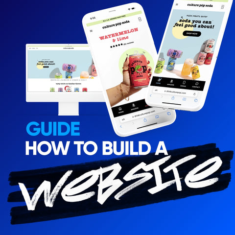
How to Design a Website


Third, try these:

Start A Free Shopify Site!

Analyze Your Traffic and Win!

